Changes in microbial communities during international travel
JReceveur
To show the code used click either the code tab on the right side above each box or at the top of the document
library(vegan)
library(MASS)
library(ggplot2)
library(plyr)
library(dplyr)
library(magrittr)
library(scales)
library(grid)
library(reshape2)
library(phyloseq)
library(randomForest)
library(knitr)
library(ape)
library(ggpubr)
cbPalette <- c("#999999", "#E69F00", "#56B4E9", "#009E73", "#F0E442", "#0072B2", "#D55E00", "#000000","#CC79A7")
theme_set(theme_bw(base_size = 18)+theme(panel.grid.major = element_blank(), panel.grid.minor = element_blank()))
biom=import_biom("C:\\Users\\Joe Receveur\\Documents\\Virtual Box\\BeninSwab\\Outputs\\BeninSwabR.biom",parseFunction= parse_taxonomy_greengenes)
meta=read.table("C:\\Users\\Joe Receveur\\Documents\\Virtual Box\\BeninSwab\\Metadata\\sample-metadata.txt",header=TRUE)
meta=sample_data(meta)
sample_names(meta)=meta$SampleID
physeq=merge_phyloseq(biom,meta)
physeq <- subset_taxa(physeq, Family != "mitochondria" & Class != "Chloroplast")
GP= rarefy_even_depth(physeq, sample.size = 17500,
  rngseed = FALSE, replace = TRUE, trimOTUs = TRUE, verbose = TRUE)
GP
## phyloseq-class experiment-level object
## otu_table() OTU Table: [ 673 taxa and 50 samples ]
## sample_data() Sample Data: [ 50 samples by 9 sample variables ]
## tax_table() Taxonomy Table: [ 673 taxa by 13 taxonomic ranks ]physeq=GP
sample_data(physeq)$Timepoint = factor(sample_data(physeq)$Timepoint, levels = c("DayOfDeparture","ArrivalBenin","DepartingBenin","ArrivalGeneva","DepartingGeneva","ArrivalHome","1WeekPost","2WeekPost")) #fixes x-axis labelsOverview
Study Design: Samples were taken from four locations (Ears, Eyes, Nares, and Mouth) on four subjects during international travel to Benin and Switzerland over the course of two weeks and one week after returning.
Only Mouth and Nares samples have been sequenced from the following timepoints: DayOfDeparture, ArrivalBenin, DepartingBenin, ArrivalGeneva, DepartingGeneva, ArrivalHome, 1WeekPost, 2WeekPost
Alpha diversity
plot_richness(physeq, x="Timepoint",color="Timepoint", measures=c("Simpson"))+geom_boxplot(aes(x=Timepoint, y=value, color=Timepoint), alpha=0.05)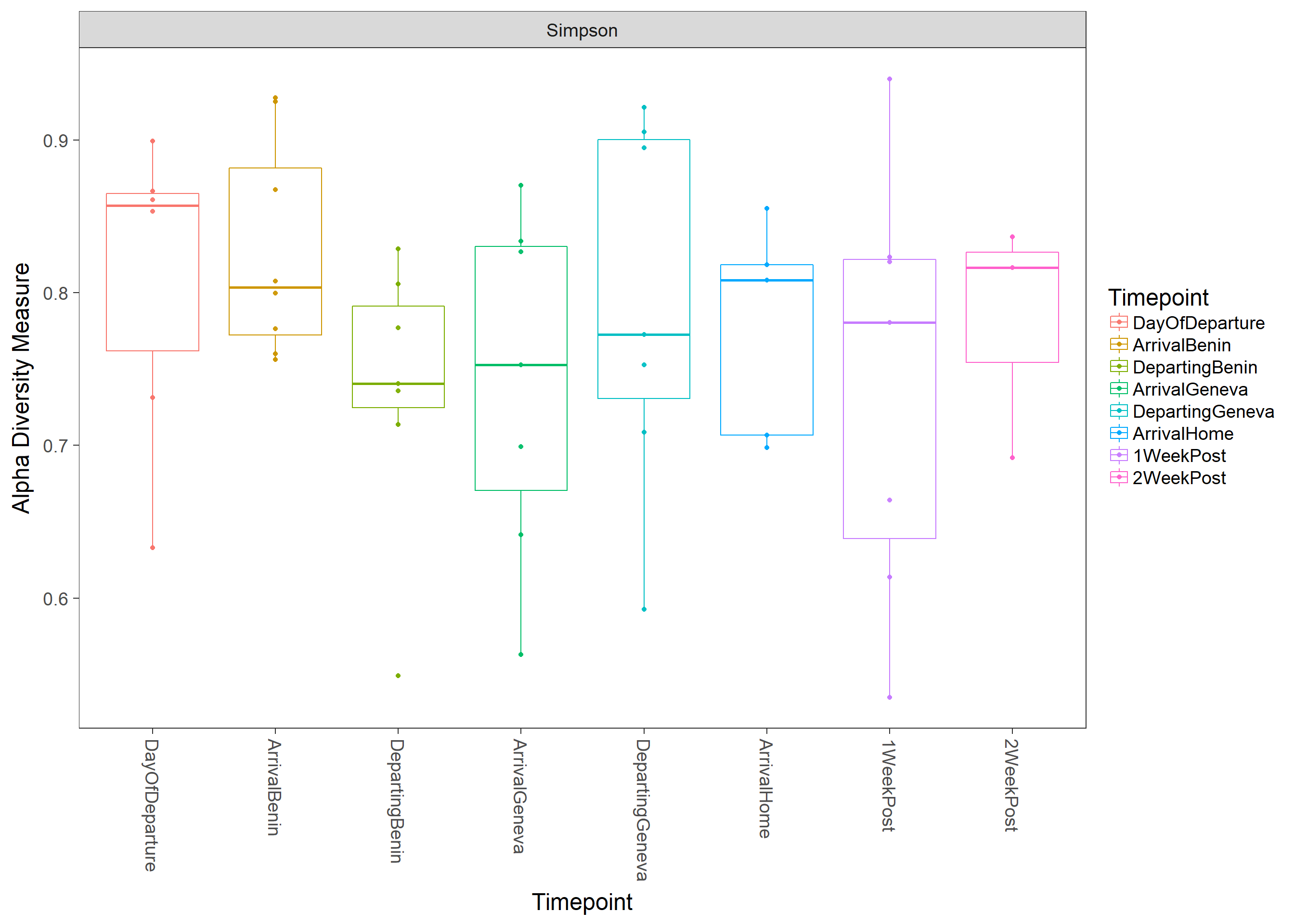
Taxonomic Composition
GPr  = transform_sample_counts(physeq, function(x) x / sum(x) ) #transform samples based on relative abundance
GPrPhylum=tax_glom(GPr, "Phylum")
PhylumLevel = filter_taxa(GPrPhylum, function(x) mean(x) > 1e-3, TRUE) #filter out any taxa lower tha 0.1%
GPrFamily=tax_glom(GPr,"Family")
FamilyLevel = filter_taxa(GPrFamily,function(x) mean(x) > 1e-2, TRUE) #filter out any taxa lower tha 1%
GPrGenus=tax_glom(GPr,"Genus")
GenusLevel = filter_taxa(GPrGenus, function(x) mean(x) > 1e-2, TRUE) #filter out any taxa lower tha 1%
Phylum Level stacked bar graph
df <- psmelt(PhylumLevel)
df$Abundance=df$Abundance*100
Trtdata <- ddply(df, c("Phylum", "Timepoint","Swab"), summarise,
                 N    = length(Abundance),
                 mean = mean(Abundance),
                 sd   = sd(Abundance),
                 se   = sd / sqrt(N)
)
cdataplot=ggplot(Trtdata, aes(x=Timepoint,y=mean))+geom_bar(aes(fill = Phylum),colour="black", stat="identity",position = "fill")+ facet_grid(~Swab, labeller=labeller(Sample_Type = labels))+xlab("Treatment")+ylab("Relative Abundance (> 0.1%)") + theme(axis.text.x = element_text(angle = 0, hjust = 0.5))+theme(axis.title.x=element_blank())+
  theme(axis.text.x = element_text(angle = 45, hjust = 1))+ scale_fill_manual(values=cbPalette)
cdataplot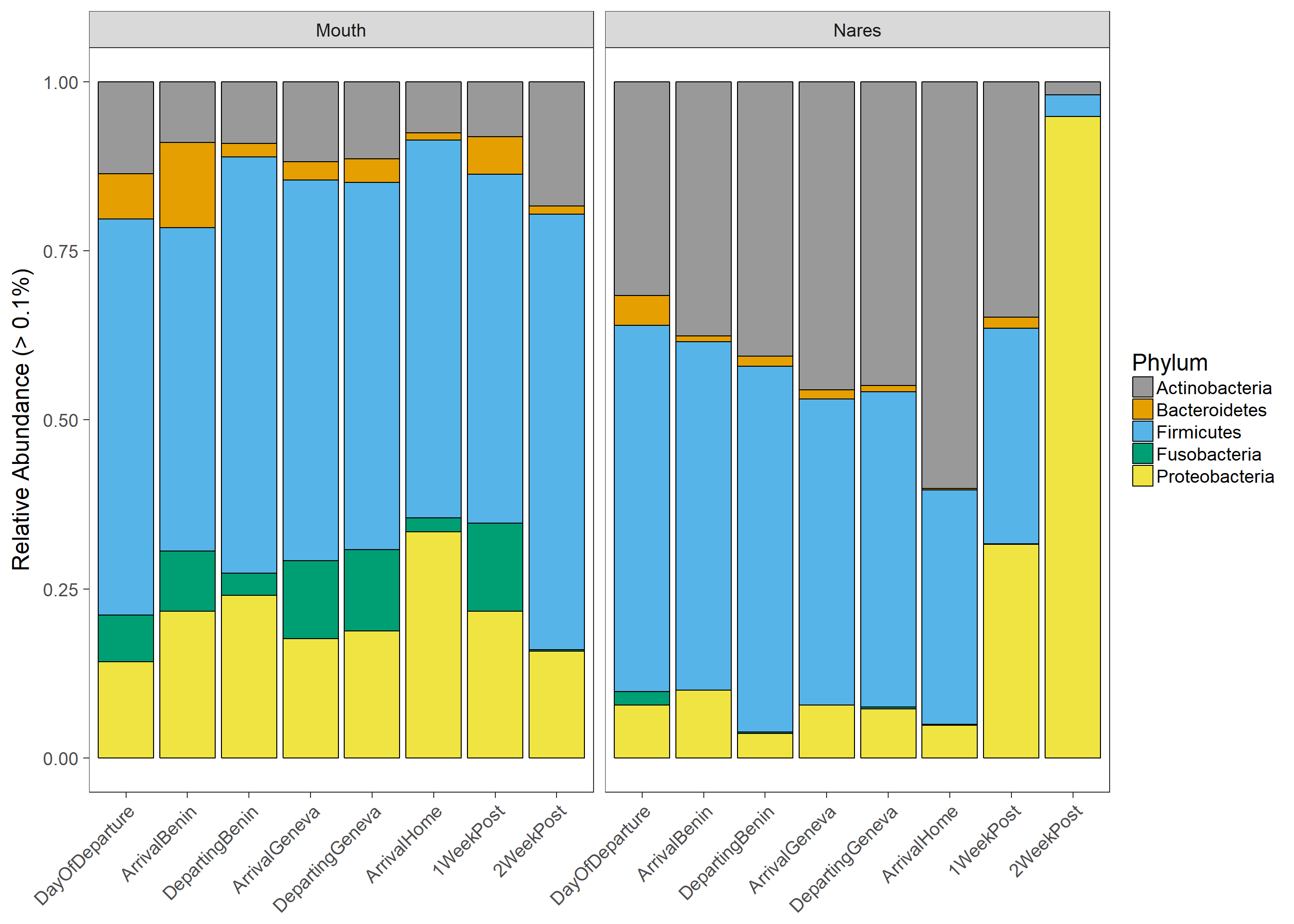
Mouth Taxa Plots
physeq=subset_samples(physeq,Timepoint!="2WeekPost")
sample_data(physeq)$Timepoint =factor(sample_data(physeq)$Timepoint, levels = c("DayOfDeparture","ArrivalBenin","DepartingBenin","ArrivalGeneva","DepartingGeneva","ArrivalHome","1WeekPost","2WeekPost"))
LInt=subset_samples(physeq,Swab=="Mouth")
LInt=subset_samples(LInt,Timepoint!="2WeekPost")
GPr  = transform_sample_counts(LInt, function(x) x / sum(x) ) #transform samples based on relative abundance
GPrPhylum=tax_glom(GPr, "Phylum")
PhylumLevel = filter_taxa(GPrPhylum, function(x) mean(x) > 1e-3, TRUE) #filter out any taxa lower tha 0.1%
GPrFamily=tax_glom(GPr,"Family")
FamilyLevel = filter_taxa(GPrFamily, function(x) mean(x) > 1e-2, TRUE) #filter out any taxa lower tha 1%
GPrGenus=tax_glom(GPr,"Genus")
GenusLevel = filter_taxa(GPrGenus, function(x) mean(x) > 1e-2, TRUE) #filter out any taxa lower tha 1%
Phylum level
Stars (*) on plot represent unadjusted p values for the test for each taxa (Wilcox or KW test depending on number of groups), pairwise adjusted p values are in the table below (FDR adjustment) Table is filtered to only show taxa with a adjusted p value below 0.1
df <- psmelt(PhylumLevel)
df$Abundance=df$Abundance*100
Trtdata <- ddply(df, c("Phylum", "Timepoint"), summarise,
                 N    = length(Abundance),
                 mean = mean(Abundance),
                 sd   = sd(Abundance),
                 se   = sd / sqrt(N)
)
p <- ggbarplot(df, x = "Timepoint", y = "Abundance",add = c("mean_se"),#"mean_se"
color = "black", palette = "cbPalette", facet.by="Phylum",
line.color = "gray", line.size = 0.4, short.panel.labs = TRUE, p.adjust.method = "fdr", fill= "Timepoint") + stat_compare_means(aes(group = Timepoint), label = "..p.signif..",label.y = 7)
p+ theme(axis.text.x = element_text(angle = 45, hjust = 1))+ylab("Relative abundance (> 0.1%)")+ theme(legend.position="none")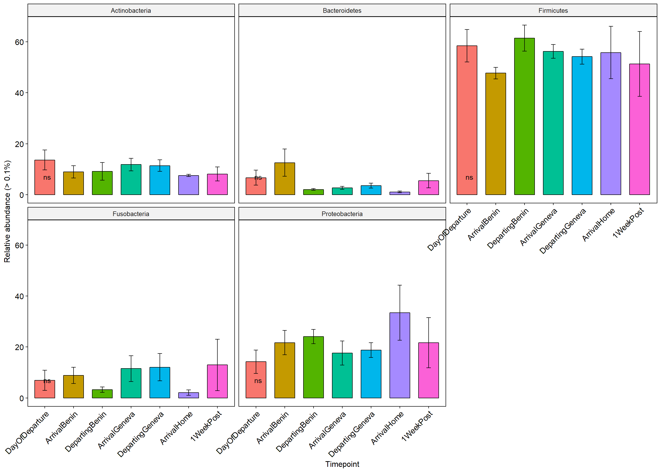
Means=compare_means(Abundance ~ Timepoint, data = df,
              group.by = "Phylum", p.adjust.method = "fdr")
#head(Means)
keeps <- c("Phylum","group1","group2","p.format","p.adj","method","p.signif")
keeps=Means[keeps]
#keeps


test3 <- list('Phylum'= keeps$Phylum,'group1'=keeps$group1,'group2'= keeps$group2 ,'p'=keeps$p.format,'p.adj'=keeps$p.adj,p.signif=keeps$p.signif,'Method'=keeps$method)
test3= as.data.frame(test3)
#test3
FilteredResults<-test3[!(test3$p.adj>0.1),]
FilteredResults
## [1] Phylum group1 group2 p p.adj p.signif Method
## <0 rows> (or 0-length row.names)Family Level
df <- psmelt(FamilyLevel)
df$Abundance=df$Abundance*100
Trtdata <- ddply(df, c("Family", "Timepoint"), summarise,
                 N    = length(Abundance),
                 mean = mean(Abundance),
                 sd   = sd(Abundance),
                 se   = sd / sqrt(N)
)
p <- ggbarplot(df, x = "Timepoint", y = "Abundance",add = c("mean_se"),#"mean_se"
color = "black", palette = "cbPalette", facet.by="Family",
line.color = "gray", line.size = 0.4, short.panel.labs = TRUE, p.adjust.method = "bonferroni", fill= "Timepoint") + stat_compare_means(aes(group = Timepoint), label = "..p.signif..",label.y = 7)
p+ theme(axis.text.x = element_text(angle = 45, hjust = 1))+ylab("Relative abundance (> 1%)")+ theme(legend.position="none")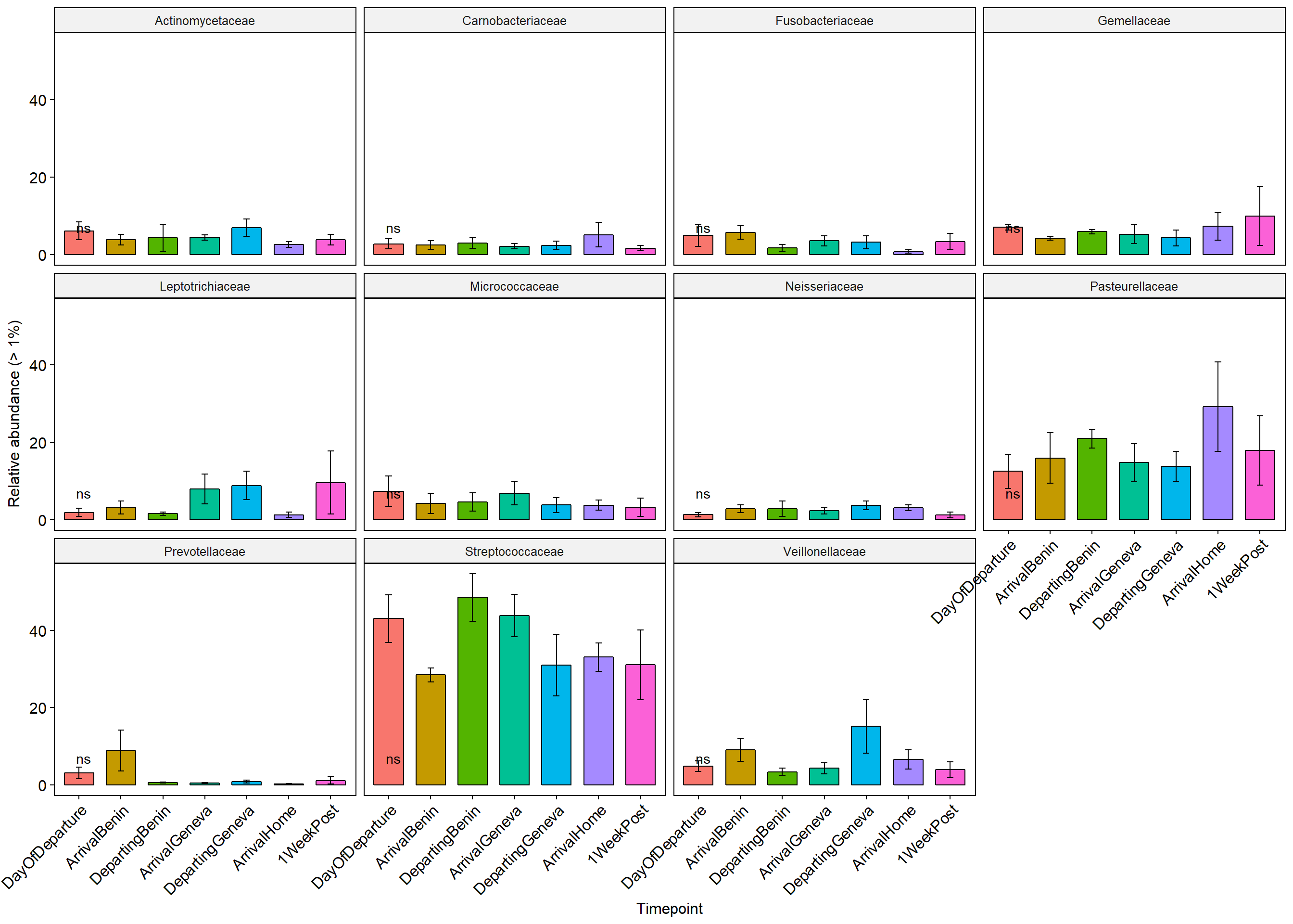
Means=compare_means(Abundance ~ Timepoint, data = df,
              group.by = "Family", p.adjust.method = "fdr")
#head(Means)
keeps <- c("Family","group1","group2","p.format","p.adj","method","p.signif")
keeps=Means[keeps]
#keeps


test3 <- list('Family'= keeps$Family,'group1'=keeps$group1,'group2'= keeps$group2 ,'p'=keeps$p.format,'p.adj'=keeps$p.adj,p.signif=keeps$p.signif,'Method'=keeps$method)
test3= as.data.frame(test3)
#test3
FilteredResults<-test3[!(test3$p.adj>0.1),]
FilteredResults
## [1] Family group1 group2 p p.adj p.signif Method
## <0 rows> (or 0-length row.names)Genus level
df <- psmelt(GenusLevel)
df$Abundance=df$Abundance*100
Trtdata <- ddply(df, c("Genus", "Timepoint"), summarise,
                 N    = length(Abundance),
                 mean = mean(Abundance),
                 sd   = sd(Abundance),
                 se   = sd / sqrt(N)
)
p <- ggbarplot(df, x = "Timepoint", y = "Abundance",add = c("mean_se"),#"mean_se"
color = "black", palette = "cbPalette", facet.by="Genus",
line.color = "gray", line.size = 0.4, short.panel.labs = TRUE, p.adjust.method = "fdr", fill= "Timepoint") + stat_compare_means(aes(group = Timepoint), label = "..p.signif..",label.y = 7)
p+ theme(axis.text.x = element_text(angle = 45, hjust = 1))+ylab("Relative abundance (> 1%)")+ theme(legend.position="none")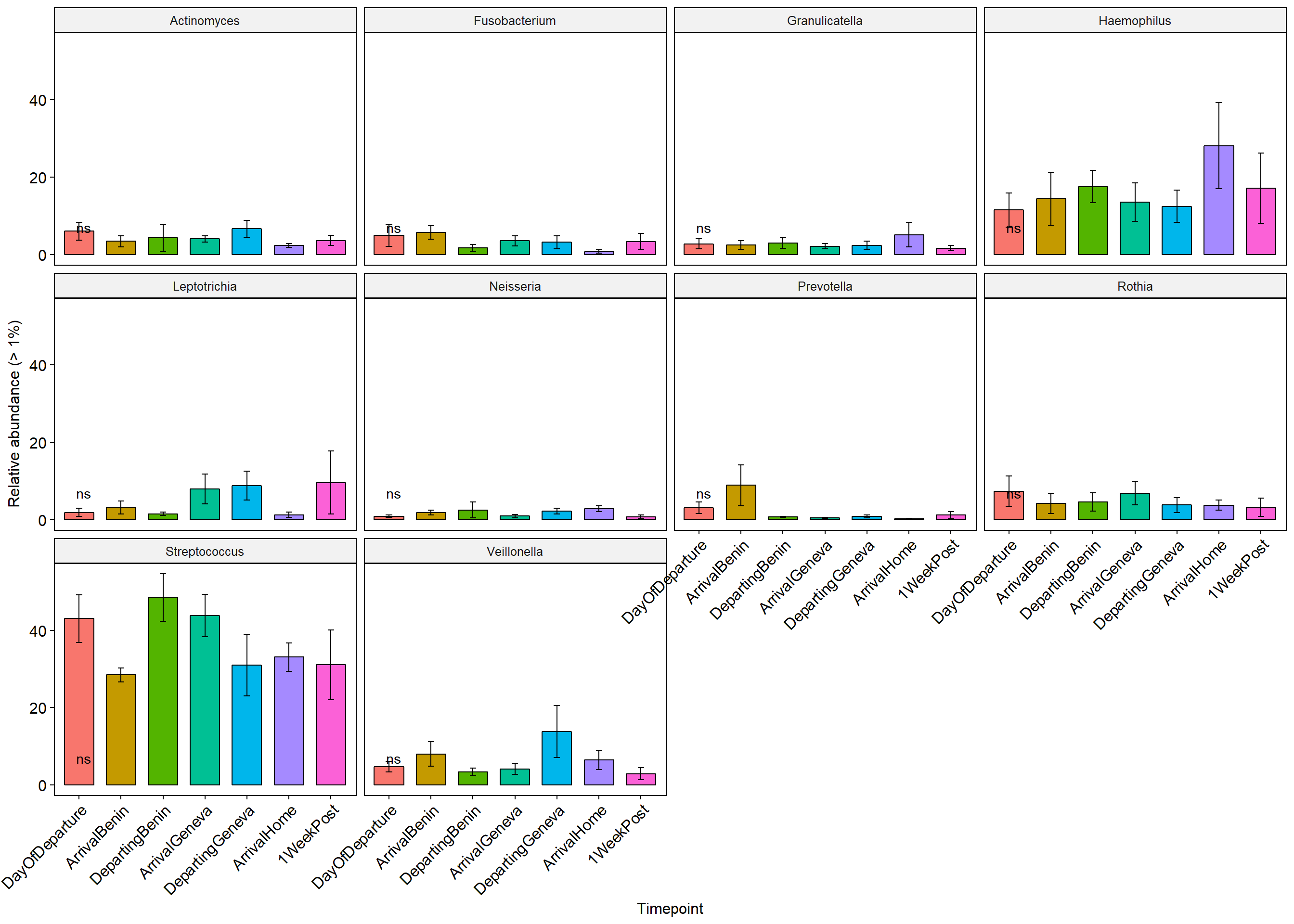
Means=compare_means(Abundance ~ Timepoint, data = df,
              group.by = "Genus", p.adjust.method = "fdr")
#head(Means)
keeps <- c("Genus","group1","group2","p.format","p.adj","method","p.signif")
keeps=Means[keeps]
#keeps


test3 <- list('Genus'= keeps$Genus,'group1'=keeps$group1,'group2'= keeps$group2 ,'p'=keeps$p.format,'p.adj'=keeps$p.adj,p.signif=keeps$p.signif,'Method'=keeps$method)
test3= as.data.frame(test3)
#test3
FilteredResults<-test3[!(test3$p.adj>0.1),]
FilteredResults
## [1] Genus group1 group2 p p.adj p.signif Method
## <0 rows> (or 0-length row.names)Nares taxa plots
LInt=subset_samples(physeq,Swab=="Nares")
LInt=subset_samples(LInt,Swab!="2WeekPost")
GPr  = transform_sample_counts(LInt, function(x) x / sum(x) ) #transform samples based on relative abundance
GPrPhylum=tax_glom(GPr, "Phylum")
PhylumLevel = filter_taxa(GPrPhylum, function(x) mean(x) > 1e-2, TRUE) #filter out any taxa lower tha 1%
GPrFamily=tax_glom(GPr,"Family")
FamilyLevel = filter_taxa(GPrFamily, function(x) mean(x) > 1e-2, TRUE) #filter out any taxa lower tha 1%
GPrGenus=tax_glom(GPr,"Genus")
GenusLevel = filter_taxa(GPrGenus, function(x) mean(x) > 1e-2, TRUE) #filter out any taxa lower tha 1%
Phylum level
Stars (*) on plot represent unadjusted p values for the test for each taxa (Wilcox or KW test depending on number of groups), pairwise adjusted p values are in the table below (FDR adjustment) Table is filtered to only show taxa with a adjusted p value below 0.1
df <- psmelt(PhylumLevel)
df$Abundance=df$Abundance*100
Trtdata <- ddply(df, c("Phylum", "Timepoint"), summarise,
                 N    = length(Abundance),
                 mean = mean(Abundance),
                 sd   = sd(Abundance),
                 se   = sd / sqrt(N)
)
p <- ggbarplot(df, x = "Timepoint", y = "Abundance",add = c("mean_se"),#"mean_se"
color = "black", palette = "cbPalette", facet.by="Phylum",
line.color = "gray", line.size = 0.4, short.panel.labs = TRUE, p.adjust.method = "fdr", fill= "Timepoint") + stat_compare_means(aes(group = Timepoint), label = "..p.signif..",label.y = 7)
p+ theme(axis.text.x = element_text(angle = 45, hjust = 1))+ylab("Relative abundance (> 1%)")+ theme(legend.position="none")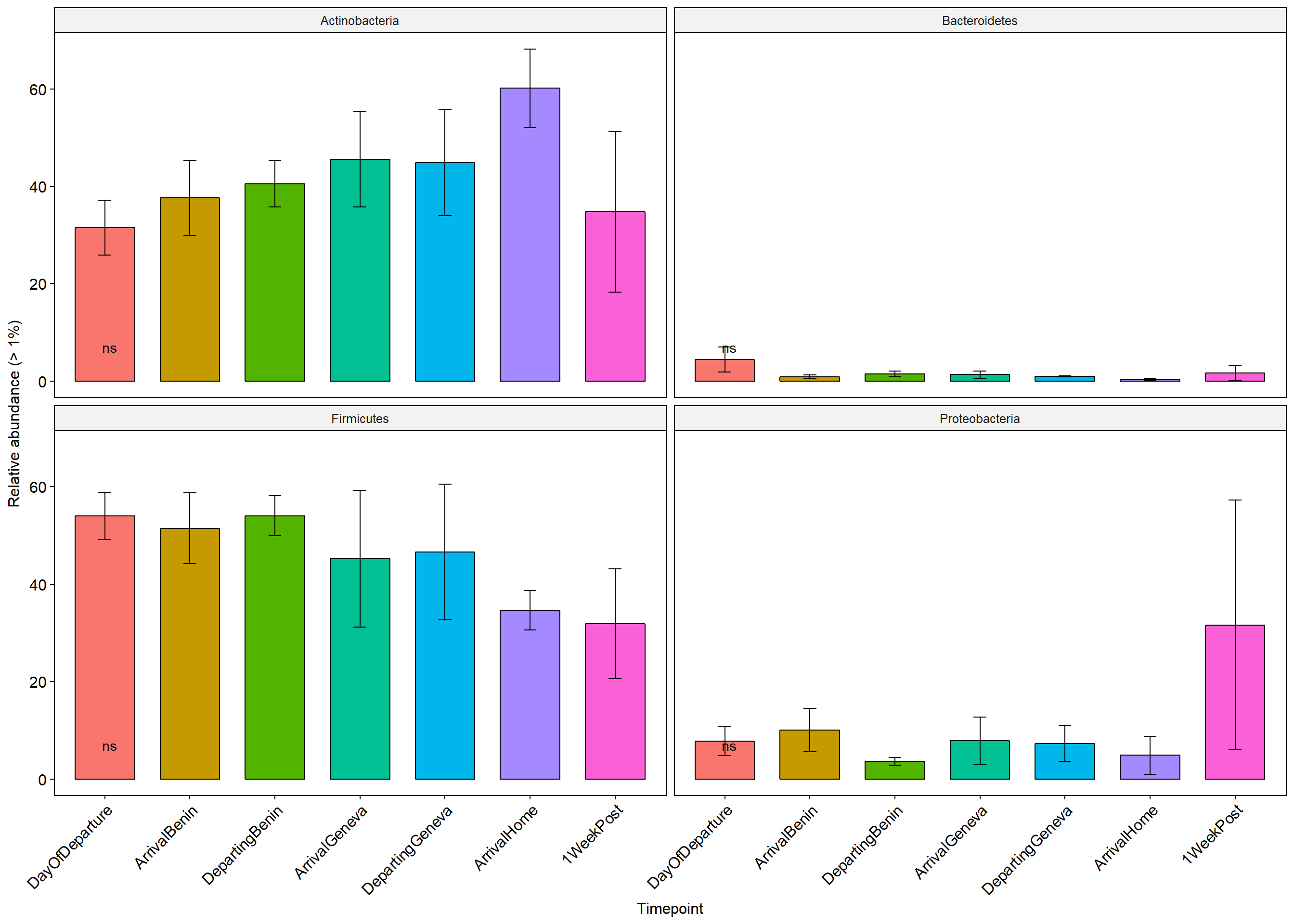
Means=compare_means(Abundance ~ Timepoint, data = df,
              group.by = "Phylum", p.adjust.method = "fdr")
#head(Means)
keeps <- c("Phylum","group1","group2","p.format","p.adj","method","p.signif")
keeps=Means[keeps]
#keeps


test3 <- list('Phylum'= keeps$Phylum,'group1'=keeps$group1,'group2'= keeps$group2 ,'p'=keeps$p.format,'p.adj'=keeps$p.adj,p.signif=keeps$p.signif,'Method'=keeps$method)
test3= as.data.frame(test3)
#test3
FilteredResults<-test3[!(test3$p.adj>0.1),]
FilteredResults
## [1] Phylum group1 group2 p p.adj p.signif Method
## <0 rows> (or 0-length row.names)Family Level
df <- psmelt(FamilyLevel)
df$Abundance=df$Abundance*100
Trtdata <- ddply(df, c("Family", "Timepoint"), summarise,
                 N    = length(Abundance),
                 mean = mean(Abundance),
                 sd   = sd(Abundance),
                 se   = sd / sqrt(N)
)
p <- ggbarplot(df, x = "Timepoint", y = "Abundance",add = c("mean_se"),#"mean_se"
color = "black", palette = "cbPalette", facet.by="Family",
line.color = "gray", line.size = 0.4, short.panel.labs = TRUE, p.adjust.method = "bonferroni", fill= "Timepoint") + stat_compare_means(aes(group = Timepoint), label = "..p.signif..",label.y = 7)
p+ theme(axis.text.x = element_text(angle = 45, hjust = 1))+ylab("Relative abundance (> 1%)")+ theme(legend.position="none")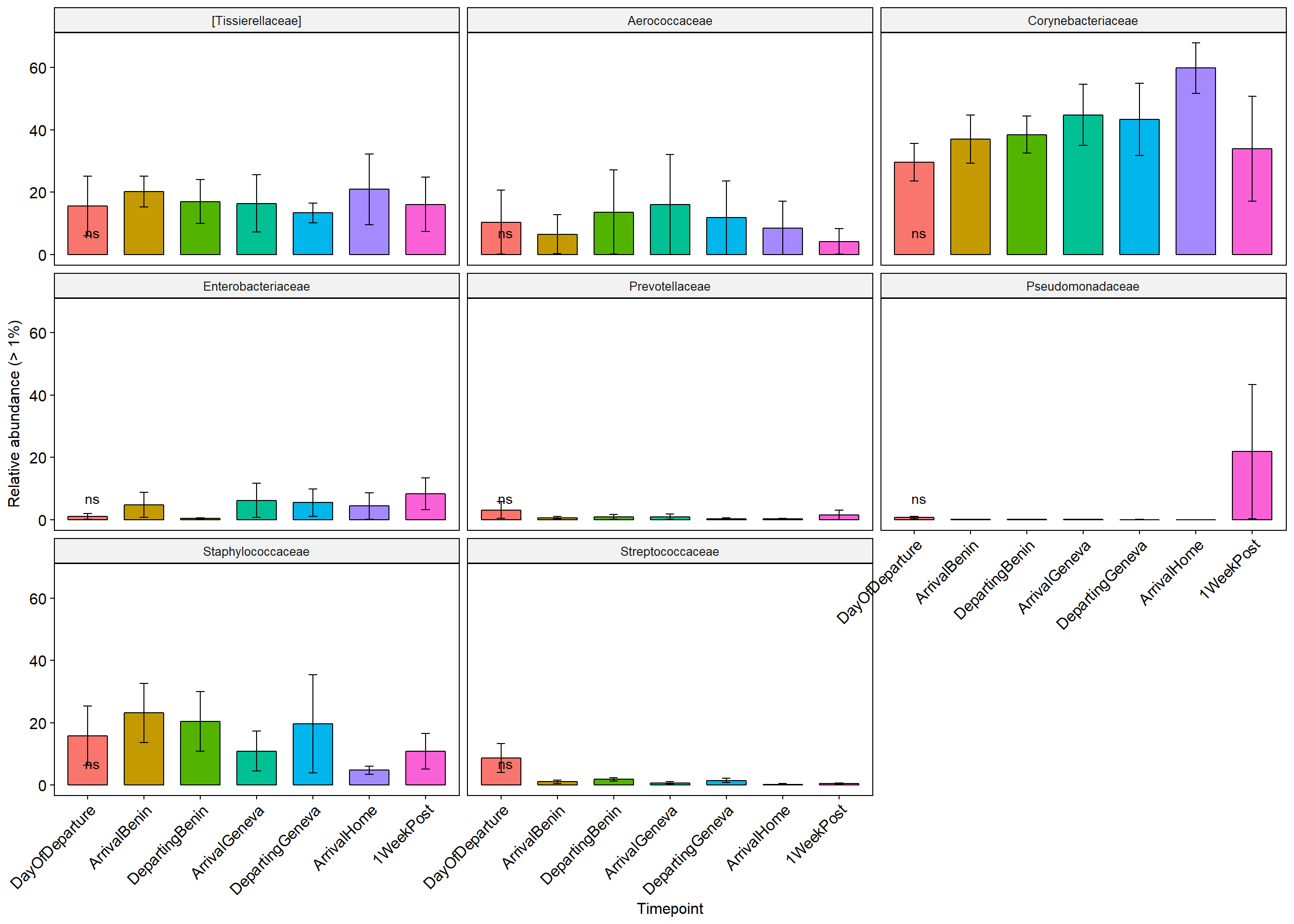
Means=compare_means(Abundance ~ Timepoint, data = df,
              group.by = "Family", p.adjust.method = "fdr")
#head(Means)
keeps <- c("Family","group1","group2","p.format","p.adj","method","p.signif")
keeps=Means[keeps]
#keeps


test3 <- list('Family'= keeps$Family,'group1'=keeps$group1,'group2'= keeps$group2 ,'p'=keeps$p.format,'p.adj'=keeps$p.adj,p.signif=keeps$p.signif,'Method'=keeps$method)
test3= as.data.frame(test3)
#test3
FilteredResults<-test3[!(test3$p.adj>0.1),]
FilteredResults
## [1] Family group1 group2 p p.adj p.signif Method
## <0 rows> (or 0-length row.names)Genus level
df <- psmelt(GenusLevel)
df$Abundance=df$Abundance*100
Trtdata <- ddply(df, c("Genus", "Timepoint"), summarise,
                 N    = length(Abundance),
                 mean = mean(Abundance),
                 sd   = sd(Abundance),
                 se   = sd / sqrt(N)
)
p <- ggbarplot(df, x = "Timepoint", y = "Abundance",add = c("mean_se"),#"mean_se"
color = "black", palette = "cbPalette", facet.by="Genus",
line.color = "gray", line.size = 0.4, short.panel.labs = TRUE, p.adjust.method = "fdr", fill= "Timepoint") + stat_compare_means(aes(group = Timepoint), label = "..p.signif..",label.y = 7)
p+ theme(axis.text.x = element_text(angle = 45, hjust = 1))+ylab("Relative abundance (> 0.1%)")+ theme(legend.position="none")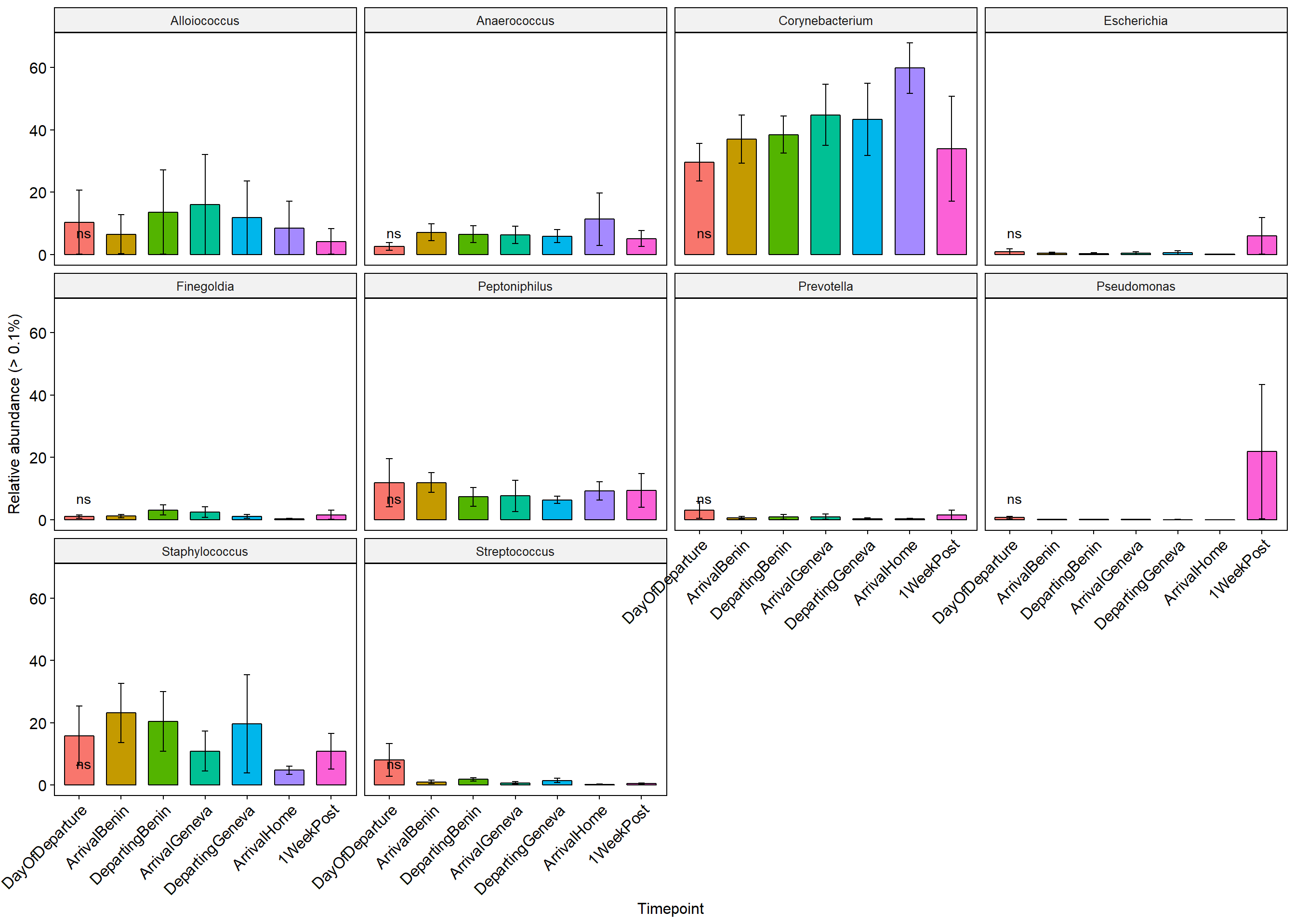
Means=compare_means(Abundance ~ Timepoint, data = df,
              group.by = "Genus", p.adjust.method = "fdr")
#head(Means)
keeps <- c("Genus","group1","group2","p.format","p.adj","method","p.signif")
keeps=Means[keeps]
#keeps


test3 <- list('Genus'= keeps$Genus,'group1'=keeps$group1,'group2'= keeps$group2 ,'p'=keeps$p.format,'p.adj'=keeps$p.adj,p.signif=keeps$p.signif,'Method'=keeps$method)
test3= as.data.frame(test3)
#test3
FilteredResults<-test3[!(test3$p.adj>0.1),]
FilteredResults
## [1] Genus group1 group2 p p.adj p.signif Method
## <0 rows> (or 0-length row.names)PERMANOVA/Ordination results
-All ordinations were conducted using Jensen-Shannon distance
-Ellipses represent 95% CI for the mean of each group
PCoA
ord=ordinate(physeq,"PCoA", "jsd")
ordplot=plot_ordination(physeq, ord,"samples", color="Timepoint")+geom_point(size=4)+scale_colour_manual(values=cbPalette)+scale_fill_manual(values=cbPalette)
ordplot+ stat_ellipse(type= "norm",geom = "polygon", alpha = 1/4, aes(fill = Timepoint))+ theme(panel.grid.major = element_blank(), panel.grid.minor = element_blank())+
  facet_wrap(~Swab)#+ theme(legend.justification=c(1,0), legend.position=c(1,0))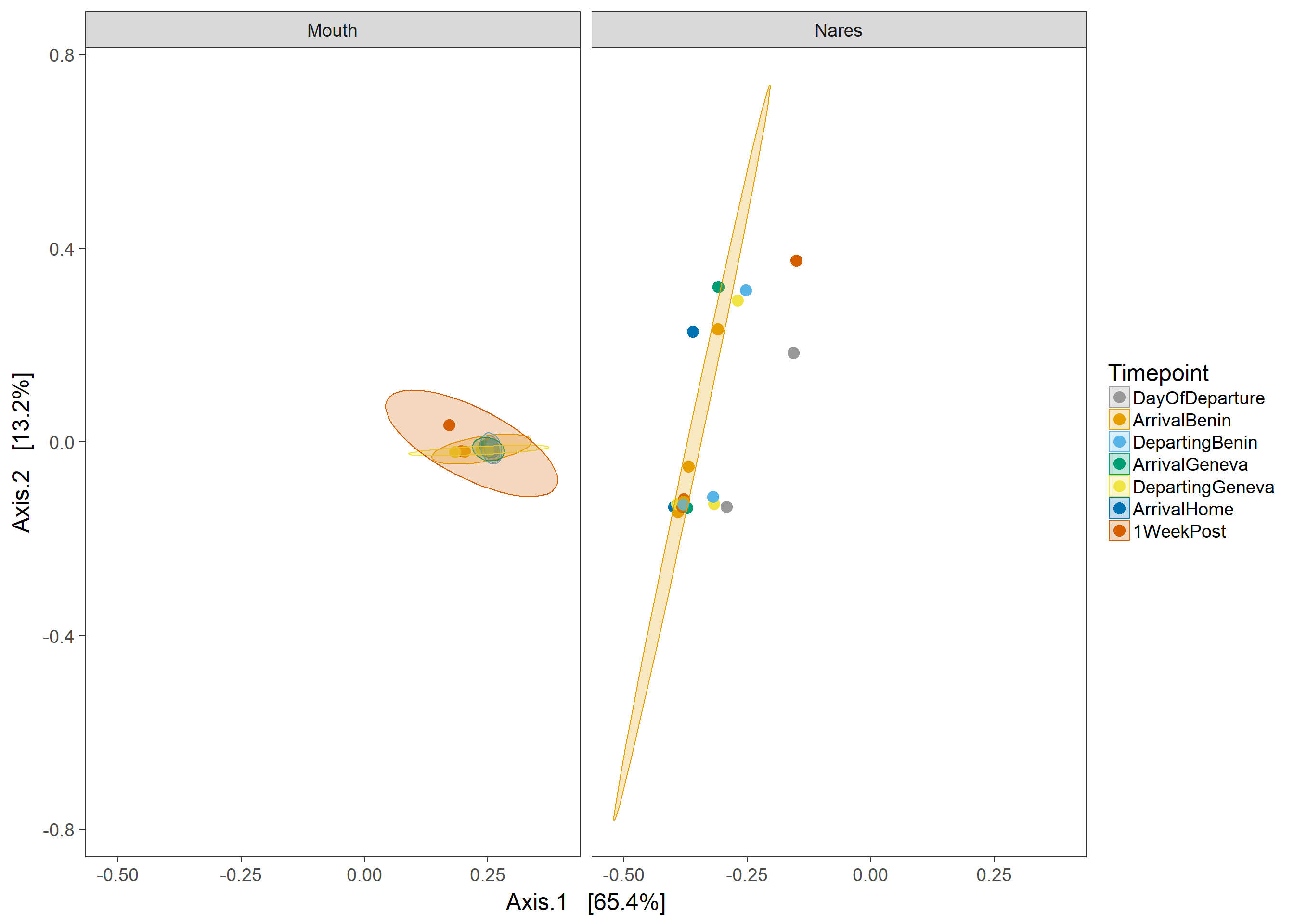
ord=ordinate(physeq,"PCoA", "jsd")
ordplot=plot_ordination(physeq, ord,"samples", color="Swab")+geom_point(size=4)+scale_colour_manual(values=cbPalette)+scale_fill_manual(values=cbPalette)
ordplot+ stat_ellipse(type= "norm",geom = "polygon", alpha = 1/4, aes(fill = Swab))+ theme(panel.grid.major = element_blank(), panel.grid.minor = element_blank())+
  facet_wrap(~Timepoint)#+ theme(legend.justification=c(1,0), legend.position=c(1,0))
PERMANOVAs
Swab type X Timepoint
See QIIME outputs for other distance metrics
GPdist=phyloseq::distance(physeq, "jsd")adonis(GPdist ~ Swab*Timepoint, as(sample_data(physeq), "data.frame"))##
## Call:
## adonis(formula = GPdist ~ Swab * Timepoint, data = as(sample_data(physeq), "data.frame"))
##
## Permutation: free
## Number of permutations: 999
##
## Terms added sequentially (first to last)
##
## Df SumsOfSqs MeanSqs F.Model R2 Pr(>F)
## Swab 1 3.7610 3.7610 67.593 0.63596 0.001 ***
## Timepoint 6 0.1944 0.0324 0.582 0.03287 0.873
## Swab:Timepoint 6 0.1223 0.0204 0.366 0.02068 0.989
## Residuals 33 1.8362 0.0556 0.31049
## Total 46 5.9138 1.00000
## ---
## Signif. codes: 0 '***' 0.001 '**' 0.01 '*' 0.05 '.' 0.1 ' ' 1